3 - User Interface
Genus Academy
Overview of the basic functionality of the editor:
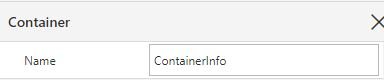
Container
Name
Name is by default containerX where X is an iterative number. You can rename the container to something more fitting or descriptive. This is useful if the model gets big.
Content
Layout defines how the content is arranged in relation to each other.
Horizontal and Vertical Alignment defines the arrangement of the content within the container.
Item spacing defines how close the content is to each other.

Header
A header consists of a Title, you can define the theme of the header in the Color and Style tab if a title is defined.
Context menu appears in the container's header and allows you to define actions in the context of the container. Note buttons or the toolbar are usually more intuitive to use for the end-user
Collapse enables the container to hide its content while only showing the title. Therefore, you will need to define a title to do this. If you don’t want the container to have a title you hack this by having a space as the title. Note that if you don’t have a title and set both collapsible and show collapsible initially to yes, your content will not be visible.

Interaction
Enabling file drop allows you to drag and drop files into the container from the end-users computer; this is further processed in a client action.
Accepted Media Types are media types that can be imported, such as Images, Audio, Video, and Applications. Applications are file types such as pdf and excel documents.
Accepted File Extensions You can leave this space blank to allow for all file types or define the file format that is allowed to be imported, such as .png or .xlxs, to choose several file types, you insert a comma and then space between them. Note the input field is quite strict, so make sure to check for any extra spaces at the end or characters if it doesn’t work the first time.
Max Number of Files is how many files you allow to be uploaded at once.
On Files Dropped, you choose a client action that processes the file; in the data filter, the input is a File object where you choose the Data to be DROPPED_FILES.

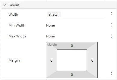
Layout
Scroll Content is None by default but can be set to vertical, horizontal, and both. This enables the user to see all of the content inside. Note the scrollbar is only visible for containers that are stretched or a fixed height; if you have fit to content, a scrollbar will not appear.
Width and Height have three settings, Stretch, Fit to content, and Enter a value.
Stretch will occupy the available space; if several controls have the stretch property, they will split the space evenly between each other unless max or min is specified. Min allows for fit to content or a value, while max can be a value.
Fit to content will fit the content. Note if you have a container with the property stretch with min equal to none inside a container with fit to content, Genus will read the content to be zero, and the outside container will not show the content.
Enter a value that makes the container a fixed width or height.
Margin and Padding can be defined either by entering the numbers manually for each side or hovering the mouse over a side; when a double-sided arrow appears, you can drag to increase or decrease margin or padding.
Margins define the distance to the next element outside the container
Padding defines the distance to the content of the container

Color and Style
Color Set is defined in Themes and defines the colors the container has. Default: Inherit, which means it will have the same color set as the parent container or viewport.
Main Theme color is the default color theme for the chosen Theme. If other color themes are defined, they will be listed below.
If you have defined a Header title, you can choose a color theme for this here.
Border of the container can be defined by width, color, and radius. The width can be defined either by entering a number in the input field, this will give a border around the whole container. One can also define a border on one or more sides by clicking the icon next to the input field. The color of the border can be a different color theme than the rest of the container. The radius will round the corners of the container. Note you will need to have a border for this to take effect.
Display separator between Children will give a faint line between the container's content. This can be used instead of dividers if you want to separate all the containers’ children.
Drop Shadow adds a shadow around the container. Default: None, but you can have up to around 15 pixels of shadow around the container. Note that it can be beneficial to add a margin around containers with shadows that will be embedded so the shadow doesn’t get cut off.

General
Visible defines if the container and its content are visible, where one can use expressions. This enables you to make it visible if certain factors are met.
Enabled defines if the container is inactive or not, this does nothing with the functionality of the container
Display Separator After adding a bit of margin in the container depending on the parent Layout. If it is vertical, it adds some margin at the bottom, while vertical adds some to the right. You can see the effect easily by adding a border to the container and seeing what happens.

Useful tips and tricks
How to find missing content
If you don’t see the content of the container, set a fixed height and/or width, this will enable you to see if something is worng with the container or that it is empty.
How to format fields across conatiners

You want the values to align on the same line across the containers.
To solve this make a container that have a horizontal alignment with two vertical aligned containers inside, where the content you want aligned are inside the same container.

Content
Label
Interaction
Layout
Color and Style
General
Content
Label
Interaction
Layout
General
Content
General
How it looks when you have the content you want to be aligned inside the same container
The content of the Display Field is defined in the Value(*) this is mandatory, and the field will not show anything if not defined.
Numbers and Datetime Only: Format Allows you to edit the format, such as add suffix on numbers (ex: 1 000.0 £) or show the relative time (ex: 15 years ago)
Word Wrap is by default enabled; it allows the display field to be multiline if the content is larger than the width.
Text Alignment is the alignment of the text.
Overflow is only possible to choose if Word Wrap is off,
Label. Default: Auto. Label is the description of the content. It can be:
Auto is the same name as the field displayed.
Use a translation is used when the app has users that speak different languages; the translations are defined in tools, translation (V2).
Select a field is where a different field is used as the label; this can be used if you want to have an adaptive label depending on some other object class, for instance.
Enter a text is a static text you define, useful when the end user doesn't use the same terminology as the programmer.
None means the display field does not have a label, it is then similar to the text controller, but you have fewer stylistic choices.
Enter an expression this is where you can define all of the above and have conditions for when to show them.
Label Position. Default: Left. Where the Label is placed relative to the content.
On Activate is a dropdown menu that allows you to choose an action that happens when you click on the display field. For instance, if you want to link to another page.
Width has three settings, Stretch, Fit to content, and Enter a value.
Stretch will occupy the available space, if several controls have the stretch property, they will split the space evenly between each other unless max or min is specified. Min allows for fit to content or a value, while max can be a value.
Fit to content will fit the length of the content.
Enter a value that makes the content a fixed width.
Margin can be defined either by entering the numbers manually for each side or hovering the mouse over a side. When a double-sided arrow appears, you can drag it to increase or decrease the margin.
Margins define the distance to the next element outside the controller
The text in the display field can be altered to either be bold, Italic, underline, and/or strikethrough
Color set is defined in Themes and defines the colors the text has. Default: Inherit, which means it will have the same color set as the parent container or viewport.
Main Theme color is the default color theme for the chosen Theme. If other color themes are defined, they will be lister below.
Tab stop Default: Yes. Enables the user to maneuver to the display field using tab; disabling this will make tabbing through the form skip this display field.
Visible defines if the display field is visible, where one can use expressions. This enables you to make it visible if certain factors are met.
Enabled defines if the display field is inactive or not; this only applies if the display field has an interaction defined
Display Separator After adds a bit of margin to the display field depending on the parents’ Layout. If it is vertical, it adds some margin at the bottom, while vertical adds some to the right. You can see the effect easily by adding a border to the container and seeing what happens.
Display Helper text. Default: When required.
Helper Text is a static text that is under the display field Value.
Screen tip is a helper text that only appears when the user hovers over the content.
The content of the Display Field is defined in the Value(*) this is mandatory, and the field will not show anything if not defined.
Datetime Only: Edit Date and Time Separately Here, you can split the date and time input in a DateTime property.
Numbers Only: Format Here, you can format the number input with a preview of how it will look (ex: 1 000.0 £).
Format Allows you to edit the format of the data type, such as numbers and dates. Note this will not appear for all data types
Text Alignment is the alignment of the text.
Placeholder Text Can be descriptive text or a prompt that the users see of what to write in the input field. It can be:
Use a translation is used when the app has users that speak different languages; the translations are defined in tools, translation (V2).
Enter a text, a static text that you define, useful for when the end user doesn't use the same terminology as the programmer.
None means the display field does not have a label, it is then similar to the text controller, but you have fewer stylistic choices.
Label. Default: Auto. Label is the description of the content. It can be:
Auto is the same name as the field displayed.
Use a translation is used when the app has users that speak different languages; the translations are defined in tools, translation (V2).
Select a field where a different field is used as the label, this can be used if you want to have an adaptive label depending on some other object class, for instance.
Enter a text, a static text that you define, useful for when the end user doesn't use the same terminology as the programmer.
None means the display field does not have a label, it is then similar to the text controller, but you have fewer stylistic choices.
Enter an expression this is where you can define all of the above and have conditions for when to show them.
Label Position. Default: Left. Where the Label is placed relative to the content.
On Activate is a dropdown menu that allows you to choose an action that happens when you click on the button next to the input field. For instance, if you want to link to another page.
Defer Change Events Default: False. Waits to send the changes this can be used to improve performance when frequent changes can trigger validation or actions. Note you can hover over the name and get a more detailed description of the functionality
Width has three settings, Stretch, Fit to content, and Enter a value.
Stretch will occupy the available space, if several controls have the stretch property, they will split the space evenly between each other unless max or min is specified. Min allows for fit to content or a value, while max can be a value.
Fit to content will fit the length of the content.
Enter a value that makes the content a fixed width.
String Only: Multiline Default: False. If the user is going to enter a lot of text, it can be beneficial to have the input field be multiline, you can define the number of lines visible.
Margin can be defined either by entering the numbers manually for each side or hovering the mouse over a side; when a double-sided arrow appears, you can drag to increase or decrease the margin.
Margins define the distance to the next element outside the controller
Tab stop Default: Yes. Enables the user to maneuver to the input field using the tab, disabling this will make tabbing through the form skip this input field.
Visible defines if the input field is visible, where one can use expressions. This enables you to make it visible if certain factors are met.
Enabled defines if the input field is inactive or not, this only applies if the input field has an interaction defined
Display Separator After adds a bit of margin to the input field depending on the parent’s Layout. If it is vertical, it adds some margin at the bottom, while vertical adds some to the right. You can see the effect easily by adding a border to the container and seeing what happens.
Display Helper text. Default: When required.
Helper Text is a static text that is under the input field Value.
Screen tip is a helper text that only appears when the user hovers over the content.
Element Type, choose between component or page
Location Type, choose between internal or external, where internal is components or pages inside the module.
Target A list of possible components or pages you can use as an embedded page depending on what you choose in Element Type and Location Type. Note to be able to choose a page it will have to have enabled embedding in other pages in the Pages settings
Data Filter Choose what data to show in the embedded content.
Tab stop Default: Yes. Enables the user to maneuver to the input field using tab. Disabling this will make tabbing through the form skip this input field.
Visible defines if the input field is visible, where one can use expressions. This enables you to make it visible if certain factors are met.
Enabled defines if the input field is inactive or not. This only applies if the input field has an interaction defined

Display Field


Input Field
Embedded Content
Layout
Show Action Bar The action bar is the toolbar at the top of a page; this can be shown in embedded content to utilize local actions or to enable search.
Show Page Title Will give the embedded content an automatic header that is the same as the title of the component or page
Width and Height have three settings, Stretch, Fit to content, and Enter a value.
Stretch will occupy the available space; if several controls have the stretch property, they will split the space evenly between each other unless max or min is specified. Min allows for fit to content or a value, while max can be a value.
Fit to content will fit the length of the content.
Enter a value that makes the content a fixed width.
